Exploring patterns in Milton’s 2022 candidate political race performance
Milton 2022 Candidate Correlations
Before the Town Election I looked at some results from the 2021 Town Elections and wondered if we would see a tighter link between candidates this year. I looked at the performance of candidates in the 10 precincts to see if their vote patterns were similar.
As many candidates this year had public support between races, I suspected that the pattern in precinct results would be similar between these races.
School Committee Results
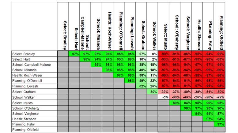
Let’s start small, by looking at the 2022 School Committee Results.
This race had five candidates. Ms. Campbell-Malone and Ms. Miranda ran as a team, as did Ms. O’Doherty and Ms. Varghese. Mr. Walker did not tightly align himself with any other candidates.
Let’s look at the correlation between the candidates. Remember “correlation” means “does one candidate do well where the other candidate does well”? If they are close to 100% correlation, that means they did well in the same precinct as each other. If it is close to negative 100%, that means one did well in a precinct where the other did badly. If it is close to 0%, there is no relationship between their precinct performance.
With this in mind, school committee results are not surprising:
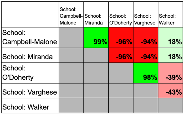
The tickets of Campbell-Malone & Miranda, as well as O’Doherty & Varghese have nearly 100% correlation, so the tickets did well or badly in precincts together.
Also those on opposite tickets are nearly negative 100%, where one did well, the other did badly.
Mr. Walker does not have a high correlation with any other candidates, meaning his performance by precinct was unrelated to the performance of the others.
This is also a good example to show what correlation is and what it is not.
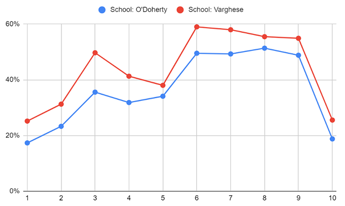
Ms. O’Doherty and Ms. Varghese have a high correlation, meaning they did well in the same precincts. But Ms. Varghese came in first place in the race with almost 2,800 votes, while Ms. O’Doherty was in fourth with almost 2,300 votes.
This graph shows that the two candidates do have a similar pattern from precinct to precinct, but Ms. Varghese outperformed Ms. O’Doherty in each precinct.
All Town Wide Races
When I looked at the 2021 results I compared the School Committee race with the Planning Board Race. In 2021 Mr. Levash running for Planning Board and Ms. Carroll running for School Committee had about an 80% correlation. They did not publically campaign together so I attribute that to generally appealing to similar people. If we see correlations higher than that, that will indicate the voters responded to the candidate coordination and messaging between races.
It seemed there were two groups of candidates messaging together formally or informally this election cycle. For convenience I will call them by the name of the winning Select Board member.
Group Bradley: Ms. Bradley & Mr. Hart (Select Board), Ms. Campbell-Malone & Ms. Miranda (School Committee), Ms. Koch-Wesser (Board of Health), Ms. O’Donnell & Mr. Levash (Planning Board)
Group Musto: Ms. Musto (Select Board), Ms. O’Doherty & Ms. Varghese (School Committee), Ms. Stenson (Board of Health), Mr. Fahy & Ms. Oldfield (Planning Board)
Mr. Graham and Mr. Walker did not seem to ally with either group in their runs for Select Board and School Committee.
Given that, I have set up a chart to see correlations between all contested town wide races except for Library Trustee.
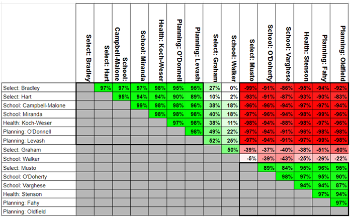
Don’t get lost in the details. Generally a pretty picture means interesting results, and that is a pretty picture. The green triangles in the top left and lower right mean the slates did similar to each other by precinct, and the red square in the middle means the two groups were opposite of each other.
I take this to mean that voters responded to the messaging of the two groups, and tended to vote for either one group or the other.
As expected, Mr. Graham and Mr. Walker were not strongly correlated with or against either group.
We can also look at graphs of performances within the groups to see these trends:
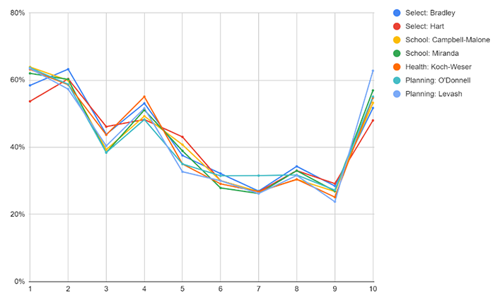
Group Bradley:
Group Musto:
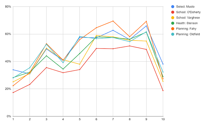
One observation of the graphs is that while both groups’ members have the same up and down patterns, those in Group Bradley are more closely packed together while Group Musto shows much more differences between individual candidates.
What these graphs and results mean for politics in Milton is a topic for another day.
Contributed by Jay Fundling, Town Meeting Member, Precinct 3.
Did you miss it?
Check out Jay’s analysis of the 2021 race in a previous article: Exploring patterns in how candidate alliances affect Milton’s town-wide races


Be the first to comment on "Exploring patterns in Milton’s 2022 candidate political race performance"